Problem
Most running apps today suffer from feature bloat. For runners focused on training, this creates noise, slows down execution, and breaks routine. Especially for beginners, it raises the barrier to building a consistent habit.
My role and solution
I was hired as a freelance product designer by the startup. The goal was to help users stick to their plan with minimal friction.
I designed a three-page architecture with swipe navigation, simple layouts, and fast access to training. This enables runners to start a workout in two taps, see progress at a glance, and maintain flow across sessions.
My approach focused on:
- Low cognitive load: stripping UI down to essentials
- Modular design system: scalable and adaptable
- Gesture-first UX: interaction that aligns with physical movement
Exploration
To balance clarity and speed, I explored multiple layout directions using rapid wireframes focused on key user flows — especially the "Start Run" journey. Early on, I used red routes and storyboarding to map where runners would hesitate or lose momentum.
This helped me prioritize:
- Minimal decision points before a run starts
- Thumb-reachable actions for mid-run adjustments
- Visual clarity over dense stats for beginners
Information Architecture
The app has three core screens:
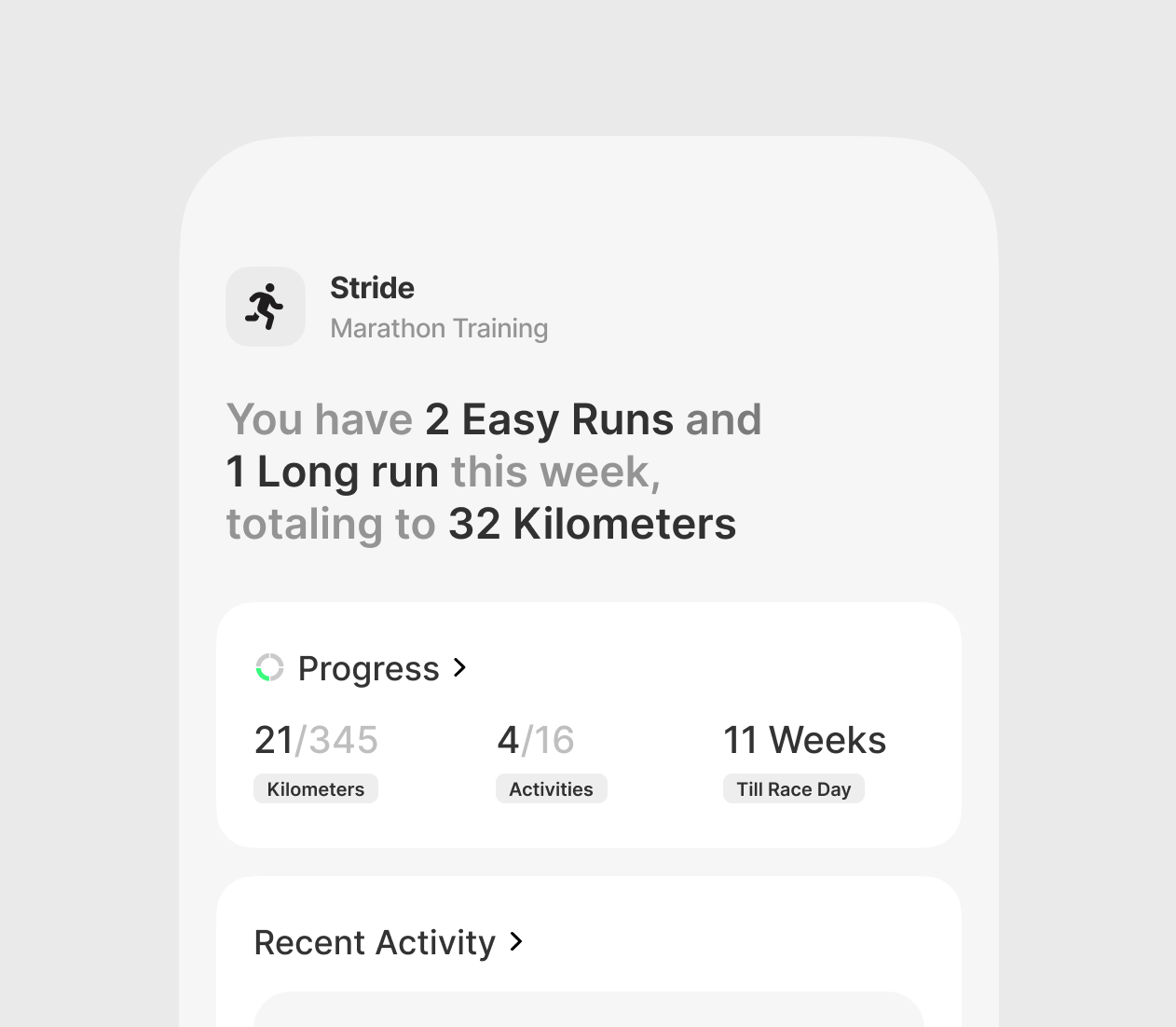
- Home → Weekly training summary, progress visuals, recent runs
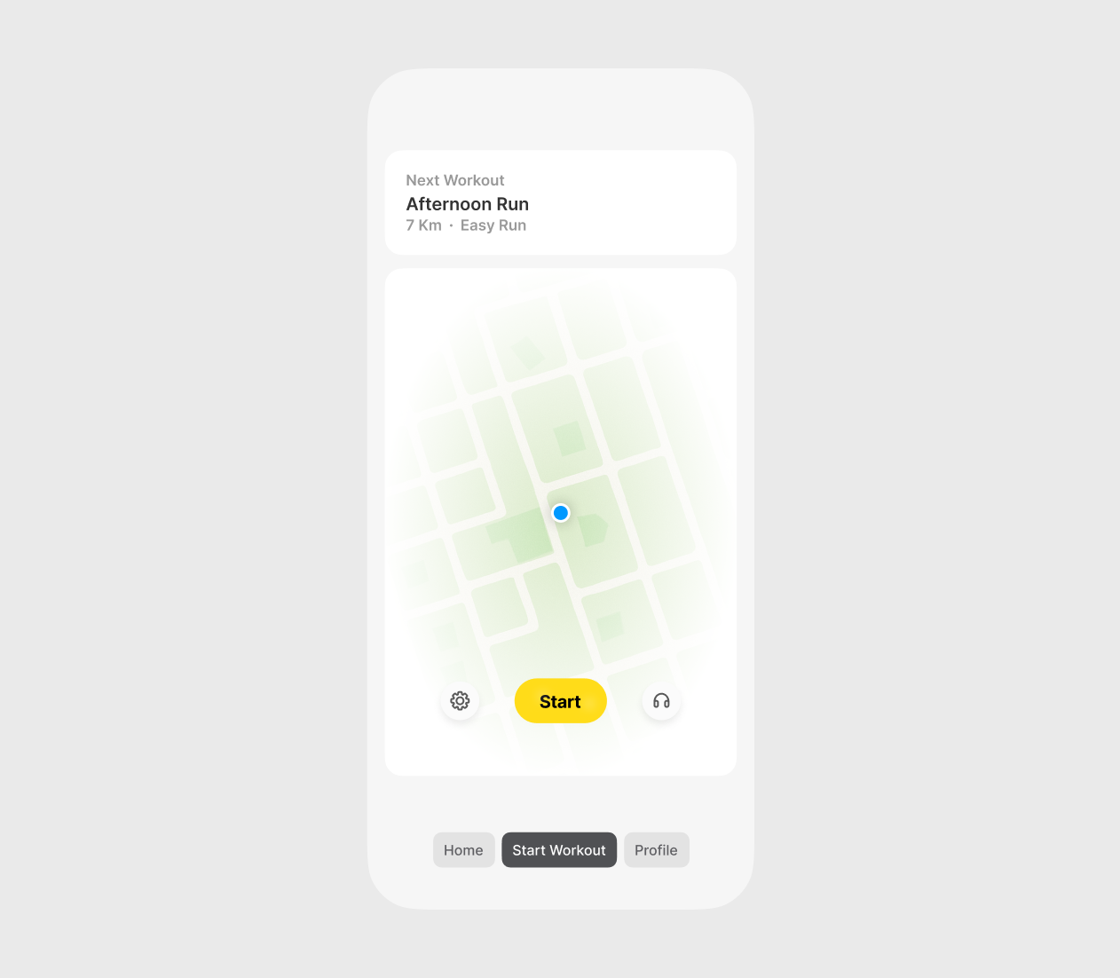
- Start → Central CTA with map background, one-tap workout launch
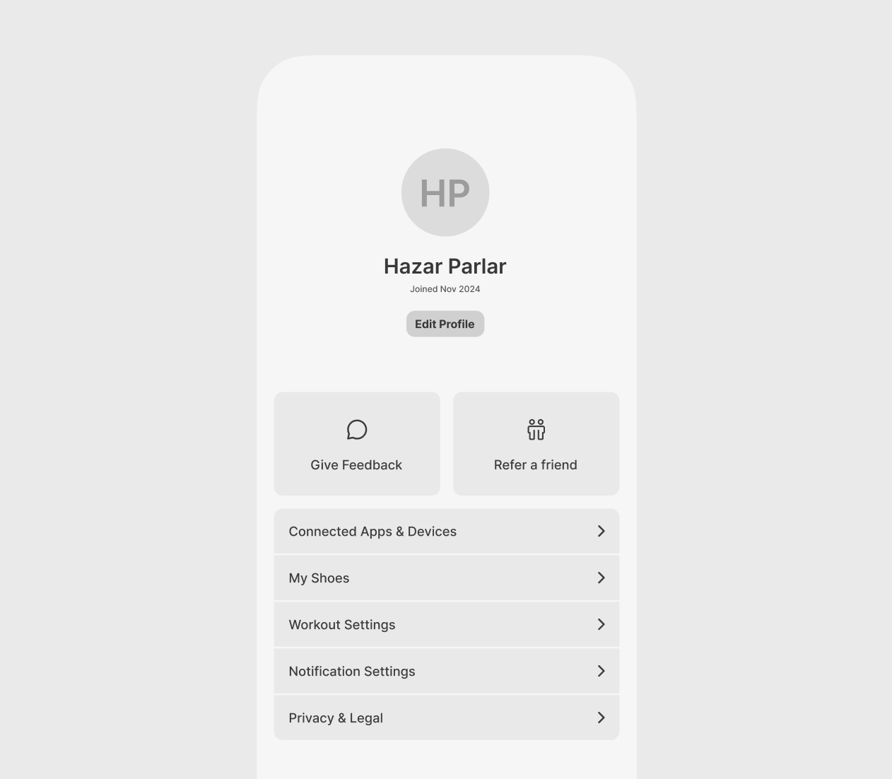
- Profile → Preferences, feedback, and integrations
Each screen has a clear job, without any mixed intent and overloading.
Why swipe navigation?
- Builds spatial memory (users know "Start" is always one swipe away)
- Reduces tapping and nested menus
- Feels more natural when used on the move (one-hand ergonomics)
Visual Hierarchy
Home screen:
- Top priority: "What's next in my plan?" — presented first. This format humanizes the product.
- Mid: Expandable visualized progress (distance, frequency, consistency)
- Bottom: Expandable activity log. This motivates the user.
Start screen:
- Map serves as context. Users care about the location accuracy.
- Large yellow CTA — thumb-accessible
- Extra controls tucked around the edge, not competing for attention
Profile screen:
- Split cleanly into preferences, account, and integrations
Interaction Design: Built for Action
- Tap areas sized for running conditions.
- Micro-animations for screen transitions. Fluid, but fast
- One-handed use optimized across all flows
Design components like cards, lists, and toggles are modular. They are scalable to different user types or plan structures without redesign.
Reflection
This project was about removing friction. It taught me to think not just about features, but user state: "What does this person need at this moment, and how do I get them there with zero drag?" Design is about behavior. When done right, it becomes invisible and quietly powerful.